
Three quick ways I place a coin in its moment: metal shifts, mintmarks, and the design tweaks people miss in photos.
Metal changes that quietly tell you the era
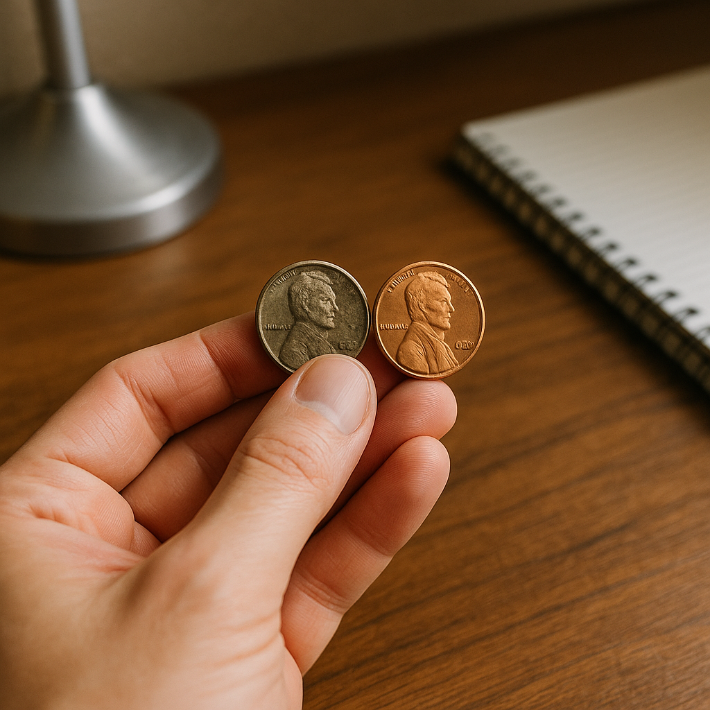
If you've ever held two coins with the same design and thought, "Why does one feel dead and the other feels sharp?" you're not imagining it. A lot of that is metal, and metal is history you can feel. I keep a little mental timeline for the common U.S. shifts because it saves me from guessing when a piece has a worn date or a seller's photos are blown out.
The big one everybody eventually learns is the 1982 Lincoln cent change. The copper-plated zinc cents ring differently on a hard surface (I don't recommend a full-on drop test if you're trying to avoid marks, but even a gentle tap on a wooden desk can tell your ear something). They also tend to show ugly blisters and pitting under the plating when they've lived a rough life, while older copper cents wear in a smoother, more honest way. If a lot includes a bunch of 1980s pennies that look like they got acne, I'm already thinking: modern composition, modern storage issues, and usually modern neglect.
Then there's 1965 for dimes and quarters, and 1971 for half dollars, where the loss of silver changes everything about luster and edge color. On pre-1965 dimes and quarters, the edge doesn't have that obvious copper stripe. Even without fancy tools, you can spot it by just rotating the rim under a desk lamp. It's one of those tells that connects directly to the moment silver got pulled out of daily use, which is its own little economic story.
War nickels (1942 to 1945) are my favorite metal-history shorthand because they look ordinary until you remember why they exist. The alloy shift was a wartime decision, and the large mintmark above Monticello on the reverse makes that history visible on purpose. When I see one in a junk box, I don't just think "nickel." I think material rationing, industrial demand, and a government that wanted the public to recognize the change instantly.
One practical note from doing this at a table full of mixed lots: don't let toning fool you into thinking "older." Both copper and silver can tone beautifully, and modern base-metal coins can tone in ways that are frankly kind of gross. Use the edge, the surface texture, and known composition switch dates as your anchor, then let color be the garnish.
Mintmarks as little travel documents (and why they move)
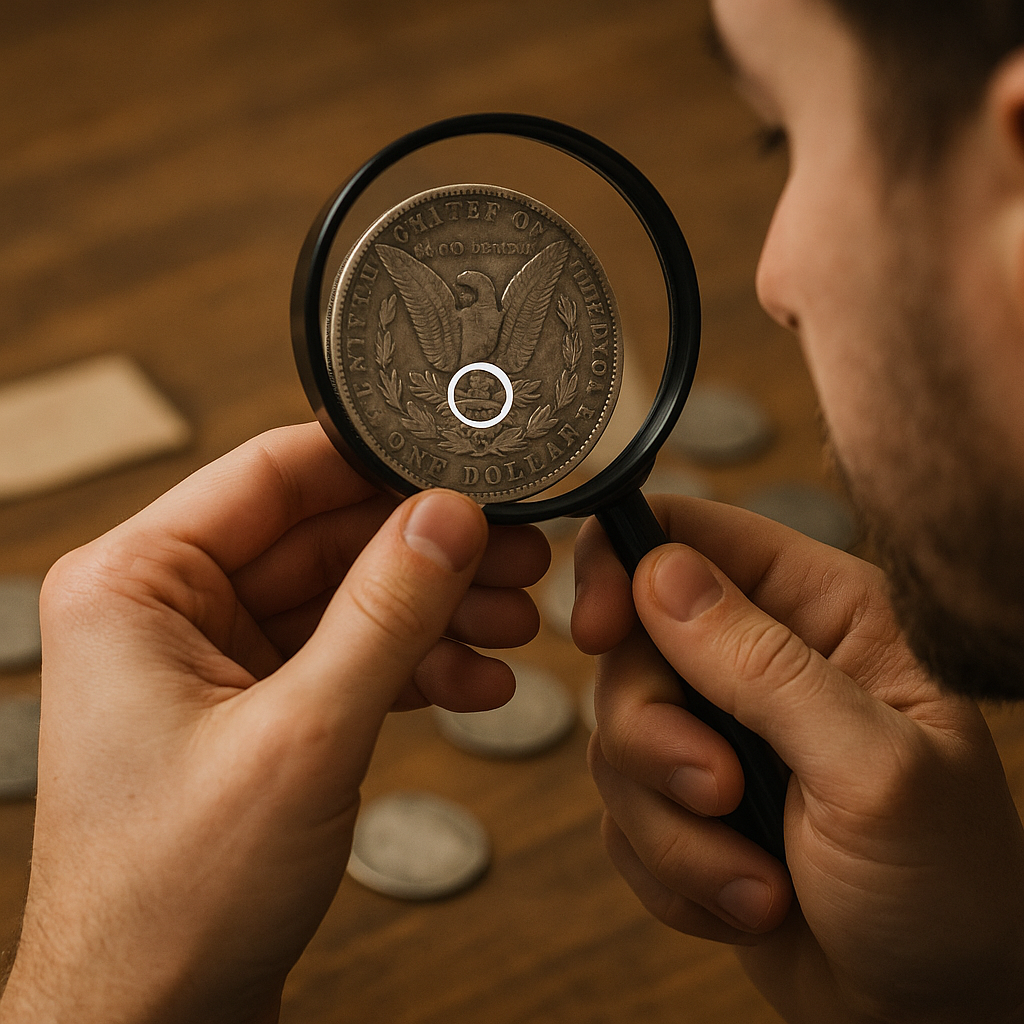
I used to treat mintmarks like a checkbox. Then I started paying attention to when they disappear, when they show up in a weird spot, and when a coin suddenly shouts its mint in a way it didn't the year before. That's when mintmarks stopped being trivia and started reading like logistics. If you're collecting with any interest in historical context, mintmarks are basically little travel documents stamped into the design.
Start with the obvious emotional beat that gets people hooked: O and CC on Morgan dollars. New Orleans and Carson City are not just romantic letters, they're mints tied to specific economic and geographic stories. The CC in particular is a reminder of the Comstock Lode era and the federal urge to process western bullion on site. Even when I'm not buying, I like seeing a Carson City coin in person because it feels like a physical artifact of that mining-to-mint pipeline.
The other mintmark story I find myself explaining at shows is why S doesn't always mean scarce and P doesn't always mean common. San Francisco minted huge quantities in some eras and then later became known for proof coinage. Philadelphia skipped the mintmark on many coins for a long stretch, which confuses new collectors because the absence of a letter feels like a missing detail. It's not missing. It's the policy. You can almost hear the institutional shrug in it: this is the default mint, so we don't need to label it.
When you see a mintmark relocate on the design over time, it usually isn't because an engraver got bored. It can come from redesigns, anti-counterfeiting tweaks, and production realities. The historical context is that mints were juggling throughput, die life, and public expectations. A tiny letter is one of the few parts that can be moved without rewriting the entire coin.
Two quick, hands-on habits that keep me honest: First, I look at mintmark style (shape and placement) in the same way I look at a font on a document. If it looks off, I slow down and compare to a trusted reference photo from an auction archive or a reputable numismatic site. Second, I remind myself that a mintmark alone doesn't make a story valuable. It makes a story specific. The value comes from scarcity, demand, and condition, but the history comes from why that coin had to be made there in the first place.
If you're sorting a mixed lot, mintmarks are also a practical way to keep your brain from melting. Make small piles by letter, then you can spot the outliers fast. The moment you find the one coin that doesn't match the rest of the group, you usually find the interesting backstory, too.
Design tweaks that map to national mood swings
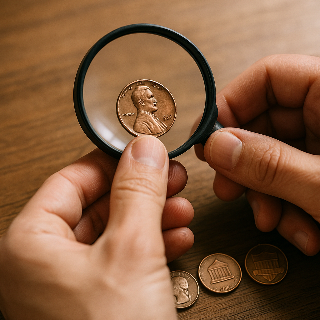
There's a reason collectors argue about tiny design details that normal people would never notice: those details are often where the historical context hides. Not in a grand speech. In the thickness of lettering, the presence of a motto, or the way an eagle is posed when the country wants to project strength versus stability.
I like using Lincoln cents as an easy on-ramp because you can watch national priorities shift without needing specialist knowledge. The 1909 debut brings In God We Trust and a real person on a circulating coin, which was a big cultural step. Then the reverse changes are basically a scrapbook: wheat ears for an agrarian, work-and-plenty vibe; the Lincoln Memorial in 1959, which reads like mid-century monumentality; and later the shield reverse, which is bluntly about unity and endurance. If you line them up on the table, it doesn't feel subtle. It feels like somebody turning the volume knob on what the country wants to say about itself.
Jefferson nickels do something similar, but in a more fussy, production-driven way that I find charming. The Monticello reverse changes, the sharper versus softer relief, and the modern-era redesigns are all a mix of aesthetics and manufacturing. When people complain that newer coins look flatter, I get it, but that's also part of the story: high-speed production and die longevity have a vote in the final look. That's historical context, too, just the industrial version.
For quarters, the big state and national park programs are obvious, but what's interesting is what it did to collecting behavior. I watched non-collectors become date-and-mint checkers overnight because they were trying to fill maps. The coins didn't just reflect culture, they created a little mini-culture at kitchen tables and in office drawers. If you're trying to explain why modern circulating pieces matter, that's the angle that lands: the designs changed who paid attention.
When I'm looking at a coin I don't immediately recognize, I focus on three things before I even care about grade: (1) what symbols are being emphasized, (2) what text is present or newly added, and (3) whether the overall style feels like Art Deco, mid-century formal, or modern simplified. It's not foolproof, but it gets you in the right decade surprisingly often, and it pushes you to ask the better question: what was going on when they chose to show the country this way?
The fun part is that you can do this with one coin in your hand and no big lecture. You just notice. Then you look up why. And suddenly you aren't only collecting objects, you're collecting the decisions behind them.